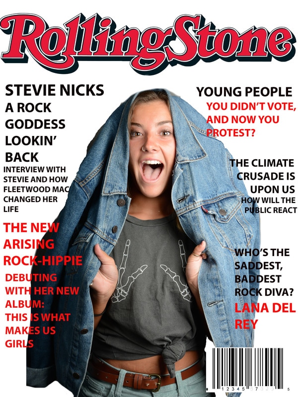
 I chose this magazine cover because I figured it would be fun to come up with headlines and have a creative picture on the cover. As I was creating this, I I kept having to go back and forth on how Rolling Stone places their headlines. The fonts I used vary between 28-30 font and I thought it would be interesting to do black and red colors. This photo was taken in a mock studio, and one of my classmates took this picture of me. The soft box we used for the studio lighting really helped bring out the colors, and made them soft. What also helped with the lighting of this picture was the reflector, it made it much brighter and was complimented by the soft box.
0 Comments
Leave a Reply. |
I'm Madi and I'm new to photography so I hope you enjoy my posts!
Archives
May 2017
Categories |
 RSS Feed
